 overlay
Make your stream recognizable without covering the moment
Build a restrained visual system for alerts, chat, and goals that stays readable over real gameplay and on a viewer's phone.
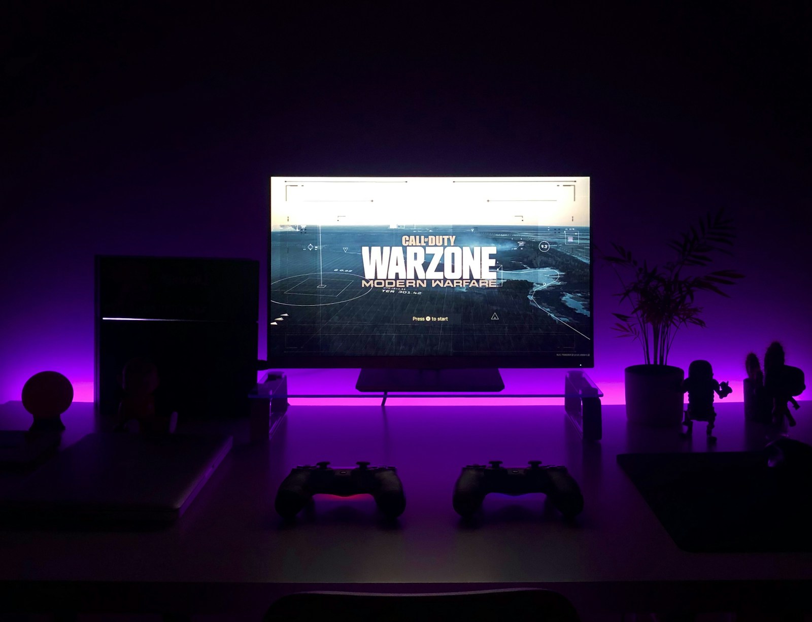
A memorable stream does not need every corner to move. Your game, camera, conversation, and community already compete for attention. The job of an overlay is to make important moments easier to understand while giving the channel a consistent identity. Start with what viewers need to see, then add personality around it.
Decide what deserves attention
List the information each scene needs. A gameplay scene may need a camera, one alert area, and a small goal. A chatting scene may have room for a larger chat panel. A starting-soon scene can carry more branding because there is no active gameplay to cover. Do not copy the same layout into every scene simply because it fits your canvas.
Give alerts temporary priority and keep persistent widgets quieter. An alert should announce a moment and then leave; a goal should be readable without drawing your eye on every frame. If chat is already displayed by the platform, decide whether placing it inside the video adds value for recordings, mobile viewers, or your content format.
Build a small, repeatable visual system
Choose one primary accent, one secondary accent, and neutral colors for text and surfaces. Use the primary accent for the moments that matter rather than for every border. Pick one readable typeface for names and numbers, with an optional display face for short labels. A consistent type scale is more useful than a different font for each widget.
Set a spacing rhythm and reuse it across chat, alerts, and goals. Align their edges when they appear together. The exact spacing depends on your canvas, but consistency makes several separate widgets feel like one channel identity. Keep an unedited version of each package so you can reverse experiments.
Test contrast against the worst background
A widget that looks crisp against an empty editor may disappear over snow, a bright menu, or a busy city scene. Test it over both light and dark gameplay frames. If your text vanishes, add a restrained backing surface or shadow before increasing glow. Glow can express a style, but it is not a substitute for legible letter shapes.
WCAG's contrast targets are a useful design reference: 4.5 to 1 for normal text and 3 to 1 for large text. These web-accessibility targets do not certify a video overlay as accessible, but they give you a concrete starting point. Check the actual text and background colors, then verify the result after recording and compression. Never use color alone to distinguish success, failure, or progress.
Design for the small version viewers receive
Open a recording on your phone at its normal viewing size. Can you read the alert name without zooming? Is the goal label understandable? Does a chat message cover a game's health bar? This is a better test than inspecting a full-resolution canvas from a few inches away.
Allow space for the longest plausible display name, a wide number, and several lines of chat. Decide whether text wraps, truncates, or adjusts within a defined region. Do not let a long name push the rest of a widget across the scene. Keep critical game interfaces and subtitles clear, and check every game or scene arrangement you regularly use.
Give motion a clear beginning and end
An entrance draws attention, a short stable period gives viewers time to read, and an exit returns attention to the stream. Repeated pulses and permanent particles can make the quieter moments feel noisy. Match animation duration to the amount of information rather than making every event equally long.
Test several alerts in succession. A dramatic single alert can become exhausting when queued repeatedly. Avoid rapid flashing, and keep audio changes proportionate: an event should not surprise viewers with a large jump in loudness. Record tests and compare them with your normal voice and game levels instead of judging sound in isolation.
Review with a simple quality checklist
- Identity: do the widgets share colors, type, and spacing without looking identical?
- Readability: are names and numbers clear over light, dark, and busy scenes?
- Placement: are gameplay controls, captions, and the creator's face unobstructed?
- Resilience: do long names and large values stay inside the intended region?
- Motion: can viewers read the message, and does attention return to the content?
- Sound: are repeated events comfortable alongside voice and game audio?
Change one variable at a time and compare short recordings. You do not need a new widget to solve every design problem; moving a panel, reducing a border, or simplifying a color palette may be enough. Start with the free OverlayWizard widget if you want to practice the workflow before choosing a paid style.
Make the show, not the overlay, the main event
Visual consistency can help a channel feel intentional, but an overlay cannot guarantee audience growth or engagement. Keep the decisions that improve your actual broadcast: readable information, a recognizable voice, and room for the moments people came to watch. The strongest design is the one that still works when the stream gets busy.